Setting the Tone

Setting the Tone
Interior Designer Becky Hirt shows us how art can shape the mood of your space
Last week we released Becky’s first guide around how to use artwork to create colour schemes for your home.
This week she follows up with another very practical piece – how to use art to evoke a mood or feeling within your room or space.
Becky uses some paintings from our collection to demonstrate how certain artworks can help to shape the mood and tone of a space. Read on to be inspired..
Evoking a Mood/Feeling in Your Room with Art
Written by Becky Hirt of Becky Hirt Interiors
When I work with a client in transforming a room or area within their home I’ll often ask them how they want to feel in that space. I believe that the mood should always drive how the room takes shape, because it’s important that your home supports how you want to live.
One of the easiest ways to influence the feeling that you experience in a space is to choose and hang an artwork that evokes this mood.
To demonstrate what I’m talking about, I’ve selected five paintings from The Discerning Palette.
1. Perspective
As in many landscape paintings, the artist has depicted a scene from a raised viewpoint. This creates a sense of looking down on the peaceful rural scene below, in which houses and trees are distant and small.
As human beings we tend to like and seek out views like this in real life, as they enable us to spot opportunities and threats; this in turn makes us feel secure and confident.
In biophilic design, which seeks to shape our built environments in ways that mimic natural environments, we describe this phenomenon as ‘prospect’.
As a designer I try to maximise and embrace these viewpoints inside buildings, because they have a soothing effect on our nervous systems.
So by hanging a painting like this one in your home, you’ll be activating this effect and helping to instil a sense of perspective whenever you look at it.
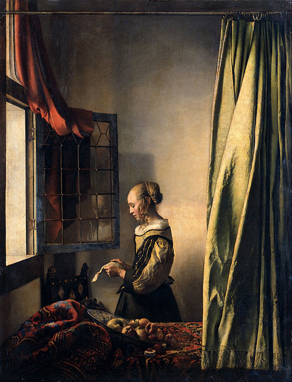
2. Intimacy

If it’s a feeling of intimacy that you’d like to create then a nude like this one could be very effective.
Most people wouldn’t choose to hang it in a living room or kitchen but it could be just the thing for a bedroom or bathroom – sanctuary rooms associated with privacy and safety.
In this artwork the subject is at once relaxed enough to adopt an open posture with her arms, and yet in her nakedness is very vulnerable. The colours are restful and muted, which means that they aren’t too stimulating.
For me, the shades the painter has chosen mimic the way that our bedrooms become places of stillness and darkness at night, though of course they are also where we unveil ourselves to anyone with whom we have chosen to share this most intimate of spaces.
3. Conviviality
In total contrast to the painting above, this still life is perfect for creating a sense of conviviality and hospitality.
The yellow and red are and enlivening and energetic. Yellow encourages optimism and happiness. Red is a colour that stimulates appetite, so, when combined with the pear and nuts on the table, it will help to get the gastric juices flowing!
The two jugs of flowers have been arranged in an informal way, making this table look relaxed and approachable.
When taken together these objects encourage anyone who sees them to look forward to a warm welcome and a good meal.
So if it’s inviting and sociable vibes you’re after, a painting like this one could work for you.
4. Action

For everything there is a season, and we all need places in our home that inspire us into activity and action.
The mood in this piece is very much one of effort and productivity, as six figures work together to harvest.
The busyness and detail in the painting are complex, while the red accents are energising and intense.
It would therefore work really well in a study or workshop – anywhere that needs to facilitate action.
In biophilic design we recognise that our built environments need to incorporate both order and complexity, so I’d balance the detail of this piece with some clean lines and soft textures to create a sense of harmony in the room.
5. Connection
Even though the two women in this painting are left anonymous, and their features aren’t depicted, it communicates so much emotion.
The hand upon the shoulder, the faces angled towards each other, the contrast between the unyielding shape of the bench and the soft and rounded bodies of the two subjects… To me it says: life is hard but we don’t have to face it alone.
Connection is vital to our sense of well-being, and our homes can be places in which to nurture a relationship with ourselves and with others.
We need our private spaces to hold us through all of life’s ups and downs. It’s important that they help us to feel and experience all of the emotions that come with being human, and remind us of our fundamental nature as social creatures.
I hope these five examples illustrate how important art is to setting the mood and tone in a room. You can find more interior design tips and tricks on my Instagram page, and you can find out more about what I do at beckyhirt.co.uk.
More About Becky Hirt Interiors
Becky Hirt is an interior designer based in Kingston Upon Thames, South West London. Through her focus on interior design and wellbeing she creates spaces that are warm, relaxed and nature inspired. She offers a flexible service that includes one-off consultations, ongoing support and full service design. Find out more about how to work with her.

-End-
On a Separate Note
Would you like to contribute to our weekly Art Advisor?
If you are an interior designer / art collector / artist/ art enthusiast and you have practical (non ‘art-jargony’) ways of helping all of us with collecting, looking after, displaying, or appreciating art, please feel free to get in touch with me about your idea(s).
We have a readership of over 2000 so it might be a good way to get your name or brand out there!