From Canvas to Palette
From Canvas to Palette
Interior Designer Becky Hirt guides us on how to craft colour schemes from an artwork

I follow quite a few Interior Designers on various social media platforms, but Becky Hirt’s account has always spoken to me. It’s full of really practical, non hoity-toity tips and advice around how to create/design spaces in your home that make you feel better.
The way she writes and talks about interior design makes you feel included and embraced.
For the Art Advisor, we are incredibly lucky to have 3 short guides from her, which will be published over this next 3 weeks. This first one is a really useful guide on on how to use an artwork to create a colour scheme for your home. Read on to be inspired.
Using an Artwork to Create a Colour Scheme
Written by Becky Hirt of Becky Hirt Interiors
As an interior designer I get excited by working with colour, but I notice that many of my clients aren’t so confident. So I’m going to share some tips on how you can create a colour scheme using a painting. It could be one that you already own, one that you’ve seen on The Discerning Palette, or it could be one that you’ve admired in a gallery or studio.

Why it makes sense to build a colour scheme using a painting..
Before I get into the hows of doing this, I should explain why I think it’s such a good idea.
Firstly, a painting is showing you how certain colours work together and the effect that these colours have on you. You have probably instinctively been drawn to a particular artwork for this reason and because the colours and composition evoke certain emotions in you.
Secondly, artists are skilled at combining colours and understanding how they work together. By drawing inspiration from their work you are tapping into this skill and expertise. This can take some of the guesswork out of choosing colours if you don’t feel confident in doing this yourself.
Finally, using a colour palette that exists in its complete form in a painting will help you to create a coherent room that feels as though it works. And if you already own this artwork then your painting can become the centrepiece of your scheme.
How to Do it..
This is how I approach using an artwork to create a colour scheme.
I like to select the main colours that have been used in an image using the eye dropper tool in programmes such as PowerPoint or Canva. You can also find colour picker tools by searching online.
You’re not trying to identify every colour in the painting, but just the major ones.
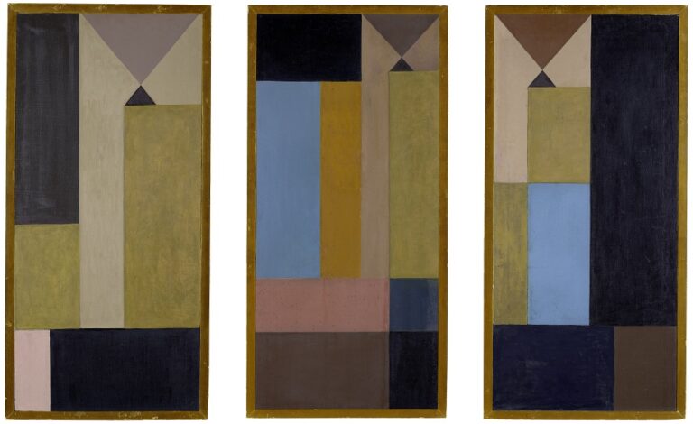
For the painting above, it might look like this:

The next step is to think about colour temperature and mood, and use your decisions to edit down your palette. For example, if you’d like to create a warm and spicey space, you might include more of the warmer, earthy hues at the top of the list (the combination on the left below), whereas if you’d like to create a cooler and more airy vibe, you might focus on the bluer ones at the bottom (the combination on the right below).


Then I tend to think about which will be my major colours, making up around 90% of the scheme – the other colours you’ve selected will become minor partners or accents. (Typically you would use the dominant colour on your walls, but this isn’t always the case.) I’ve illustrated this below:


I should say at this point that it isn’t an exact science – more an art in which you’ll lean into the colours and combinations that create the mood you’re aiming for. The combinations I’ve chosen above are quite tonal and harmonious, but for a more stimulating vibe, you can introduce a more contrasting colour.


Pulling it all together..
Once you have finalised your colour palette this will become your guide as you choose paints, flooring and other hard finishes, furnishings and furniture. That’s where the fun really starts!
Using a favourite artwork as your colour guide can bring sophistication to any room or space that you’re working on. If you don’t own the painting that you’ve been inspired by you can look for a rug or another artwork that uses a similar palette.
I hope these ideas help to inspire you with your own colour dreaming and scheming. I’ve explored this theme in one of my Instagram posts, and you can find out more about what I do at beckyhirt.co.uk.
More About Becky Hirt Interiors
Becky Hirt is an interior designer based in Kingston Upon Thames, South West London. Through her focus on interior design and wellbeing she creates spaces that are warm, relaxed and nature inspired. She offers a flexible service that includes one-off consultations, ongoing support and full service design. Find out more about how to work with her.

-End-
On a Separate Note
Would you like to contribute to our weekly Art Advisor?
If you are an interior designer / art collector / artist/ art enthusiast and you have practical (non ‘art-jargony’) ways of helping all of us with collecting, looking after, displaying, or appreciating art, please feel free to get in touch with me about your idea(s).
We have a readership of over 2000 so it might be a good way to get your name or brand out there!