Our Feature in The London Standard
Our Feature in the London Standard

It was very exciting to see the Discerning Palette featured in Amira Hashish’s article on ‘The Art of Making Your Walls Beautiful’ in The Standard newspaper, alongside some well known names in the art industry,
Amira asked us a few questions around displaying vintage art prior to the feature, so I thought it might be useful to share our full our answers here.
You can also view the full article online here.
One of the questions posed to us was whether we could share a couple of tips for hanging/displaying vintage art. Here was our answer:
I think the key to hanging vintage art is celebrating the story they have to tell.
Signs of age: Vintage pieces have history to them – they’ve been through different hands and have already been on an interesting journey before reaching you. As a result they often come with imperfections and signs of age (scuffs, losses, marks, patina) but these are to be embraced as they add value and charm. This sense of age and history will add character and warmth to your home.
Connect to Memories: Choose pieces to hang based on a visual connection – perhaps it reminds you of a place, a piece of music, something you love or someone you know. You might not be the first owner of a piece of vintage art, but it is your turn to use it to tell your story.
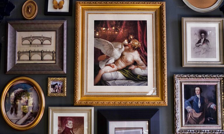
Be open to styles of hanging: We often think of filling a wall space with one large piece of art, but there are so many other ways to display art. You could try a gallery wall or cluster for a more eclectic and visually stimulating mix (this works particularly well with vintage paintings). This also enables you to build a collection without needing lots of wall space. It can be fun buying smaller pieces of art that you can lean on a kitchen shelf, a bookshelf , or a bedside table. This means you can move your art around easily and always change up the look of your space.

The next question asked was whether we would recommend including mid-century paintings into interior design schemes that combine different periods and styles. Our answer was as follows!

Absolutely! I believe this is what (in the world of interiors) they call introducing ‘stylistic tension’. It’s that subtle push-and-pull effect you feel when different styles exist in the same space or composition, but rather than clashing, they complement and enhance each other.
Mid-century art can act as the perfect bridge between traditional and modern elements.
Mid-century paintings often emphasise clean lines, bold colour fields, and abstract forms. This simplicity means they don’t compete with more ornate or classic pieces – they balance them.
They fit in well with more contemporary schemes too because they can add incredible depth and character to an otherwise clean, minimalist space.
Contemporary interiors often rely on neutral palettes, sleek lines, and minimal clutter. Mid-century paintings—especially abstracts, geometric forms, or expressionist works—inject just enough bold colour, texture, and visual interest without overwhelming the space.