How to Look at Abstract Art
by Saira Kalimuddin-May
I’ve been reading the book ‘Abstract Art’ by Stephanie Straine (part of the Art Essentials series by Thames & Hudson) and I’ve come across so many interesting pointers about how to look at abstract art that I thought I’d share some of them here as well as include some of my own thoughts.
First, I’m going to show you an example of an artwork, and then tell you the artist’s reference point so that you can make some sense of what you’re looking at.
It is very much worth noting that particularly with abstract art, you don’t NEED to know what the artist’s source(s) of inspiration is for you to appreciate the piece. But sometimes, there is no denying that it can open up a whole new level of enjoyment. Art appreciation comes largely from looking – the more you look, the more you can appreciate. By looking at lots of art, you ‘train’ your eye if you like – you find new reference points, you look out for and pick up on things that might otherwise go unnoticed.
Here’s a first example, which is a piece by established artist Frantisek Kupa (1871-1957).
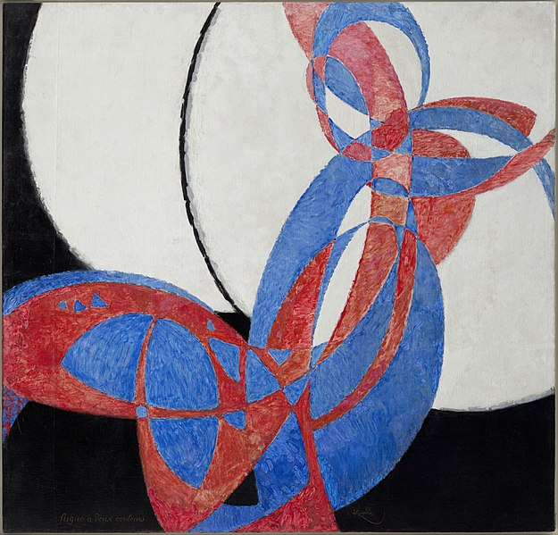
Perhaps you see a dancing figure, or maybe a butterfly. At the end of the day, you see a combination of shapes, forms, lines and colours that are in themselves very enjoyable to look at.
Now let’s take things up a notch and see if you notice more now, or at least spend more time looking..
The artist of this piece began by observing his stepdaughter Andree playing with a red and blue ball in the garden, trying to capture its arc of motion through the air, as well as her presence. Gradually he eliminated all naturalistic forms, to concentrate on the linear trajectory of the ball’s movement; a pure abstraction without any residual references to the human body or its physical environment.
The way the artist has captured this moment suggests the passage of time as well as movement in space, as trajectories criss-cross each other, implying multiple throws of the ball into the air.
Has that information opened up your imagination? Are you looking at the painting in a different way now?
So maybe the next time you see an abstract piece (like this one we have at The Discerning Palette collection), you might look beyond the shapes and forms and perhaps wonder if the artist was mimicking some type of movement or motion?

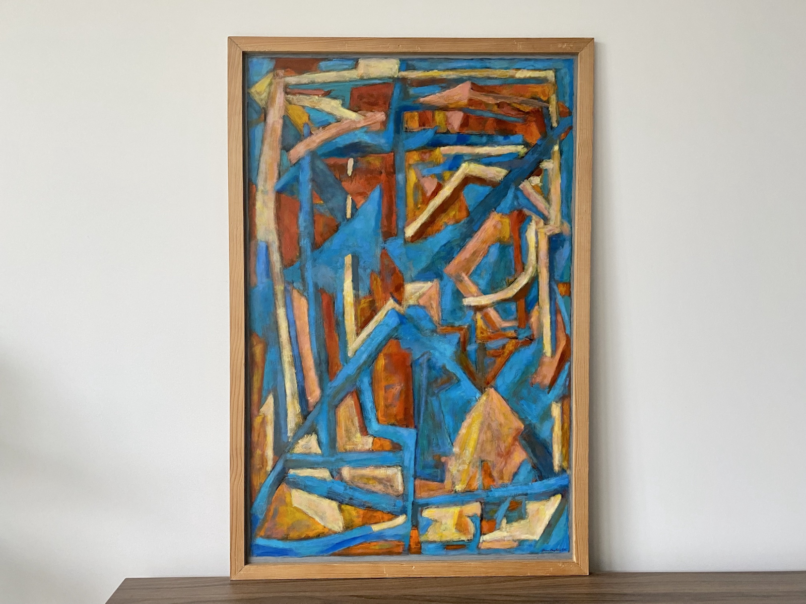
Not let’s try something different that doesn’t involve an artist’s source of inspiration but instead noticing the forms on the canvas.
Here’s a picture by Olga Rozanovaa(1886-1918)

In this one, we see various shapes painted in different colours, But what is worth noticing is that every shape is imprecise. Every painted rectangle in this composition of diagonals is imperfect, skewed or tilted, creating a dynamic effect of movement and rhythm.
With this information, it encourages our eyes to explore each shape, and to give each part of this painting its time.
Here’s a piece from our collection that if looked under similar guidance, also encourages deeper looking.
Now it’s time to move on to a different way of looking – looking ‘beyond’ the artwork.
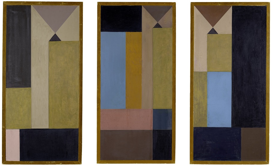
Let’s use British constructivist artist Marlow Moss’s painting as an example:
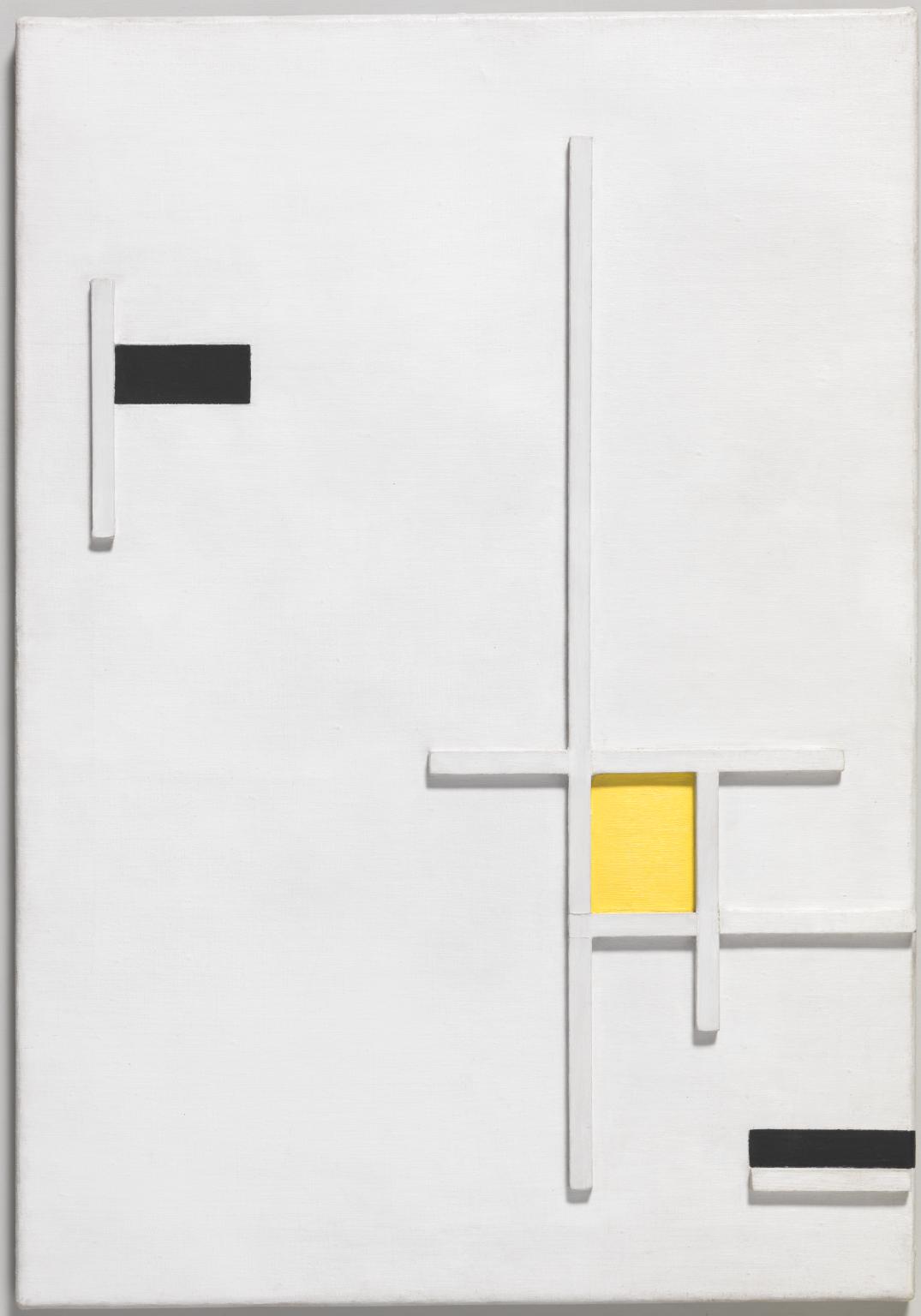
This painting assumes a three-dimensional aspect with its system of low relief linear wood elements, creating defined shadows that counterbalance the bright white expanse of the canvas surface and its yellow focal point.
This artist has used pieces of wood that create shadows, and these shadows will change shape, length and direction, depending on where the light source is coming from. But the shadows aren’t something she has created, they are an effect of the relief.
So the next time you look at a painting that’s got raised elements to it or a sculpture, notice its shadow and the way it changes when the light changes.
Here is a piece from our collection that captures this same effect brilliantly:
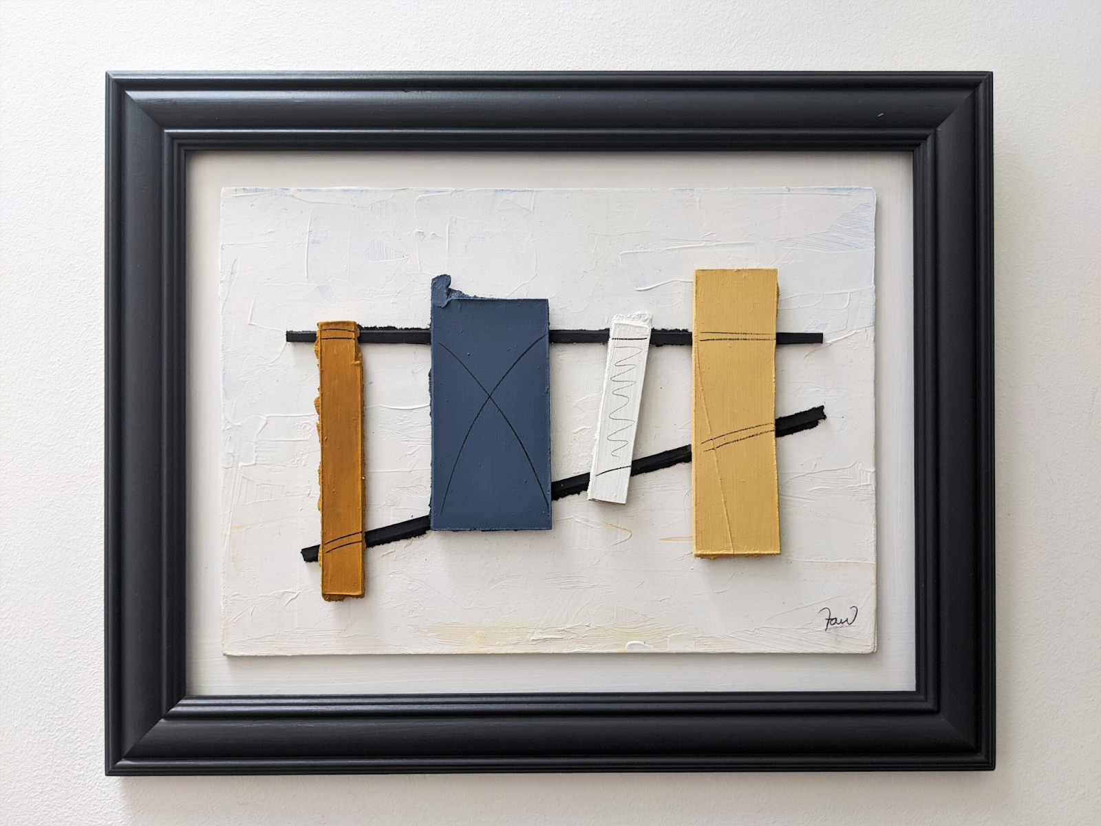
So if you were to hang this piece in your home , the way the light enters your home would in fact change the effect of it. And throughout the day, as the light changes, it would continue to change, offering up something new to your eyes at different times of the day. How cool is that!
Right time to move on again..this one might be a controversial one..
Now how do we look at paintings that are just one solid colour?
This famous one (partly famous because so many have said ‘well surely I could do that!’) by Yves Klein (1928-1962) is Untitled Blue Monochrome.

Klein has explained : ‘Blue has no dimensions, it is beyond dimensions, whereas the other colours are not..All colours arouse specific associative ideas, psychologically, material or tangible, while blue suggests at most the sea and sky, and they, after all, are in actual visible nature what is most abstract.
I’m not sure I entirely agree with Klein that blue doesn’t arouse certain ideas, but I do like the concept that his blue is suggestive of the void or the cosmos in its rich, deep emptiness.
There is something very strange about the fact that as humans it is difficult to grasp the idea of space and the universe and how there is no end to it. It is deep and continuous (as far as we know) and this painting makes me think of concepts like infinity and about how small I really am. It transports my mind to a different place altogether. The famous pure colour paintings by Rothko have the same effect on me.
Here’s a painting in our collection that can also transport the mind:

Now we move on to another type of looking, and that is to do with noticing areas which aren’t painted. In the art world, we call this ‘negative space’.
‘Negative space’ certainly plays an important role in both representational and abstract art. But in the context of the abstract, it can be quite complex.
In representational art, negative space is the area adjacent to an object.
So that means that negative spaces are typically abstract in nature; once they’re defined, the identity of the object they surround will become recognizable.
When an artist paints, he or she is acutely aware of negative space and how the interplay of negative and positive space draws the eye towards certain areas.
Even in a work that appears to be totally random, like in the drip paintings by Jackson Pollock seen below, there is actually a very definite balance of positive and negative space.
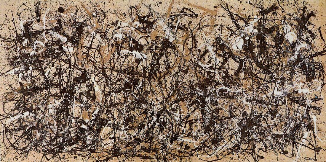
So I would certainly encourage you to shift your focus the next time you look at a painting, to notice the ‘negative space’ in the picture. Sometimes these areas are completely unpainted, or sometimes they are painted in a darker colour.
At the end of all of this, I think a key point here is that abstract art as a whole is more about what it is (and what it could be), rather than what it is not. Abstract art is open and welcoming – it facilitates a multiplicity of possible interpretations. It is a universal language that speaks to us on a level that doesn’t require anything verbal, much like music.
In the digital age that we are in, this multidirectionality is even more relatable. We now live in two worlds – our everyday tangible world, and our virtual world. Even right now, you are looking at paintings in this article in a digital format and not in a physical museum or gallery space.
How, and where we are when looking at paintings plays a huge role in how we look too.
Looking online versus looking in reality affects a myriad of things, particularly our sense of scale.But this difference in context doesn’t mean that we can’t enjoy the process of looking, or find different things to focus on depending on where we are looking from. As mentioned earlier in this article, even the time of day can affect how we see something!
Just to end off I’d like to include two very poignant quotes by one of my favourite artists, Ben Nicholson, which I think nicely sums up abstract art and what it is about:
‘After all, every movement of human life is affected by form and colour, everything we see, touch, think and feel is linked up with it.’
‘There is no need to concentrate, it comes as a part of living. I think so far from being a limited expression understood by a few, abstract art is a powerful, unlimited and universal language’.